IN THIS VANCOUVER HOME, LIGHT FEMININE TOUCHES MIXED WITH STRONG MASCULINE ACCENTS ADD UP TO A BALANCED AESTHETIC THAT SIMPLY SAYS, WELCOME
"I don’t like an overly pretty house,” says designer Kelly Deck. “It always looks as if a woman has taken over. Men should be able to live in their homes without making good-natured jokes about all the girly swirls and flourishes.” Instead, Kelly aims for a balance between feminine and masculine elements in the homes she decorates, considering everything from the furnishings and fabrics to the millwork and countertop finishes, right down to the objects she places on the fireplace mantel.
So when Kelly set out to design this 2,600-square foot, three-bedroom home in Vancouver’s Mount Pleasant neighbourhood, she executed her gender-neutral approach from the inside out, achieving a timeless look that ties the rustic to the elegant with a touch of inspiration from France.
Just look at the architectural details indoors: subtle vertical panelling is pure feminine haute couture, hinting at a romantic Parisian apartment, while the herringbone-patterned hardwood floors throughout the first level allude to men’s tweed suiting. This well-calculated mix also extends to the furniture pairings. Kelly combined hard edges with soft curves, as well as slender shapeswith bulky silhouettes. Ultimately, everything falls somewhere on the spectrum between really guy-friendly and decidedly gal-ish.
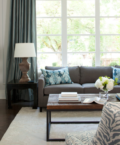
For example, the living room’s rustic coffee table, with its industrial chic aesthetic, is balanced by soft blue-grey silk drapery, cascading elegantly from the 10-foot-high ceiling to the floor. The curvy slipper chairs? Feminine. A boxy sofa? Manly, for sure. But all together, the look is well-curated and casual. “Pair your very tall and spindly floor lamp with a couple of bulky hand-worked table lamps, like I did in the living room, and you’ll suddenly notice that the objects look better as a result.”
In the family room, Kelly did the same with the accent chairs, placing a sleek, sculptural Mid-Century Modern chair kitty-corner to a chunky wooden stool. And the dining room’s statement piece, a lacey-looking chandelier, is at once both feminine and masculine with its delicacy countered by its bold black colour. Again, the dining table and chairs are sturdy and practical, but the brushed-nickel hardware on the room’s pocket doors is the exquisite jewellery that adds a hit of sparkle.
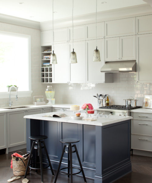
For a masculine edge that packs a softer punch than black, Kelly used navy blue. It grounds girly all-white spaces and often appears in surprising places: on the blocky kitchen island, for example, as well as the exterior of a reclaimed antique clawfoot tub in the master bathroom. “When you pair soft greys and whites with navy instead of black, you activate the space,” says Kelly. “While black is typically used to anchor a room, navy achieves the same, but as a chromatic hue, giving spaces a customized look and real personality.” Put differently: Navy blue is one part practical and one part expressive – a triumphant testament to Kelly’s chica-meets-chico design approach.
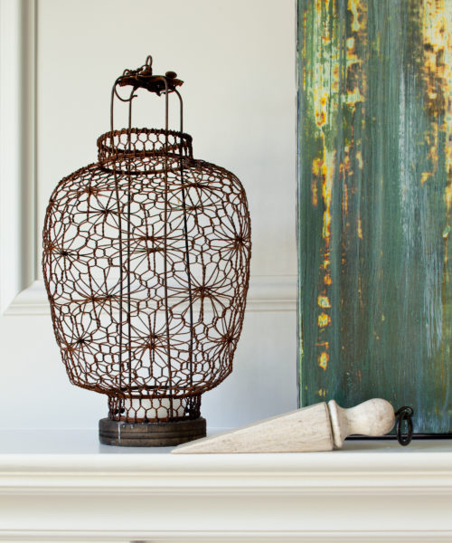
RIGHT: In the Paris-inspired living room, a boxy sofa and urn-shaped table lamps keep the space from feeling fussy. Slipper chairs, upholstered in a blue zebra print, provide visual movement and add a feminine curve. DESIGN, Kelly Deck Design, kellydeck.com; Placid CL3231W WALL PAINT, General Paint; COFFEE TABLE, Moe’s Home Collection; RUG, East India Carpets; TOSS CUSHIONS, The Cross Decor & Design; Mitchell Gold + Bob Williams SOFA, Once a Tree Furniture; silk DRAPERY FABRIC, Robert Allen. OPPOSITE Simple displays, such as this rustic wire lantern paired with a wooden doorstop, create some interest without all the clutter. Wire LANTERN, Peking Lounge.
LEFT: The kitchen’s soft grey perimeter creates a gentle frame for the bold navy blue island at its centre. The upper cabinets, extended all the way to the ceiling, offer lots more storage, and who doesn’t want that? Tax Day CL3097N ISLAND PAINT, Tinman CL3232W CABINETRY PAINT, General Paint; Bianco Carrara marble ISLAND TOP, Marble Art Canada; COUNTERTOP, Caesarstone; BACKSPLASH TILE in Pussy Willow Grey, Creekside Tile; Tom Dixon PENDANTS, Inform Interiors; DRINK DISPENSER, Pottery Barn; FAUCET, Aquabrass; STOOLS, IKEA.
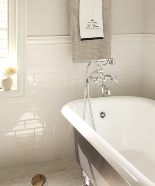
The reclaimed tub was completely reglazed and the exterior finished in navy blue, turning it into a statement piece that echoes the other punches of navy throughout the house; “Lean a print against a wall to create an instant vignette anywhere,” says Kelly, referring to the white bedside display that’s romantic yet sleek; to keep the master bathroom from seeming like an afterthought, Kelly applied her code of contrast, pairing simple Shaker-style cabinetry with super-glam chandeliers.


