DESIGNER KELLY DECK TURNS TO TRADITIONAL ARCHITECTURAL FEATURES AND A EUROPEAN SENSIBILITY TO CREATE A NEWBUILD HOME THAT’S SLIGHTLY DIFFERENT THAN THE REST
Imagine you’re a young family looking for your dream home. You want something where you can raise your children, welcome impromptu visitors, host big get-togethers – a place where you can put down roots and create new memories.
You wonder what kind of house this would be – what style, what design? If you were to consult designer Kelly Deck, this home would be it. Because when her firm was hired by the reputable builder Blakewood Homes to design a dwelling in a leafy Vancouver neighbourhood two years ago, that was her goal: to create something that would accommodate the hustle and bustle of family life – a veritable Grand Central Station in its established West End area.
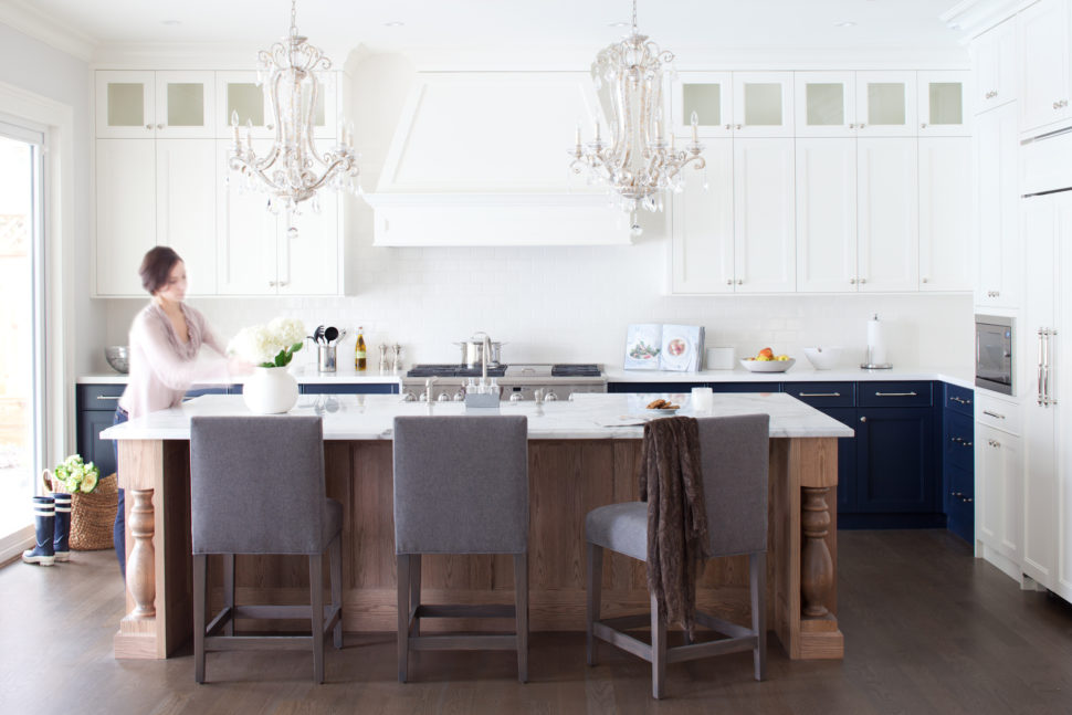
“We imagined a large family growing up in this home,” says Kelly, who shares design advice in her Globe and Mail column and is known for her HGTV show Take It Outside. On the main level, a massive 22-by-54-foot great room offers plenty of space for hanging out and entertaining – whether accommodating a group of kids after soccer practice or hosting a formal dinner party. “So there are things like a big dining table and an island outfitted with bar stools in the great room,” says Kelly, “and then a separate formal dining room with a wet bar.”
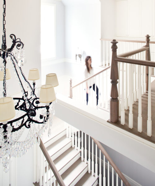
Unquestionably family oriented in functionality, this grand 6,000-square-foot, two-storey house needed an aesthetic that would stand the test of time. It’s not uncommon to see new-builds with a traditional style, but Kelly eschewed any cookie-cutter look and instead painstakingly considered the architectural details – even researching elements and having them custom made by skilled craftsmen – which lent the house its distinctive, timeless flavour. Leading up from the vast foyer, for example, the staircase was inspired by southern United States colonial homes from the 1930s.
“You can’t find newel posts like that anymore,” says Kelly. “We did a lot of research, found this profile and had them custom turned for this home.”
Given the house’s grand proportions and impressive architectural bones, Kelly had to ensure that the overall aesthetic seemed approachable – not too formal or fussy – and able to sustain a laid-back West Coast lifestyle.
“The house has a stately formality, but at the same time it’s just really unpretentious,” she says. She created a relaxed atmosphere with a soothing, light colour scheme, natural fabrics, clean-lined furnishings and hits of soft overscaled pattern. “We envisioned something that was inspired by the look of a European farmhouse,” she says. Wood, especially oak, plays a dominant role throughout the home. “Oak is common for us to use because it takes stains so beautifully,” says Kelly, “and it has a really inherent grain and that works with the sort of rustic, relaxed quality of this house.”
Storage was also a huge consideration. Built-in millwork (which Kelly prefers over stand-alone cabinets or utility closets) features closed and open storage. She realizes that tucking things away is important, but it’s also essential to offer spots for display or for simply keeping useful items within easy reach. “When things get all closed up, it almost starts to feel really uptight, especially in a home like this,” says Kelly. “It feels like there’s no room to just throw a book somewhere.”
“Little benches, little hooks, little shelves and extra drawers...they’re the things that a lot of people sacrifice on,” she adds, “but those are the things you’re grateful for every single day because they make life so much easier.” After all, throughout the design process, Kelly never forgot that, while this house, as grand as it is, is a dream home, the people who live here are indeed very real.
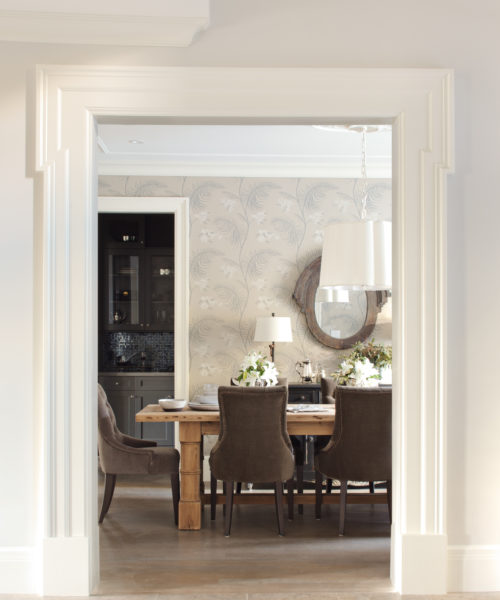
LEFT: In the formal dining room, curvaceous chairs surround a rustic wooden table, exemplifying the room’s elegant, comfortable vibe. The wallpaper, which inspired the home’s grey, white and wood-toned colour palette, adds visual interest and softness to the room. “And I think it identifies it as a special space in the home,” says Kelly. Wallpaper, Cole & Son; Scallop chandelier, Circa Lighting; dining table & chairs, Restoration Hardware; custom drapery, Kelly Deck Design.
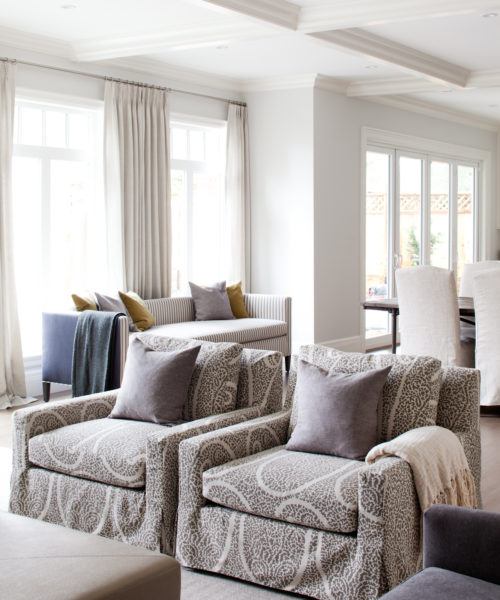
RIGHT: The spacious great room includes the kitchen, casual dining area and living room and features architectural elements like grey-stained oak floors, chunky moulding and a coffered ceiling, which give the space warmth and character. “You must have detail on the ceiling in large spaces – otherwise they just feel vacuous,” says Kelly.
Dining table & chairs, Restoration Hardware; bar stools, Kelly Deck Design.
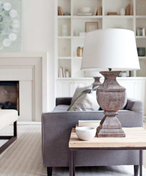
LEFT: In the living room, the fireplace is flanked by white-painted built-ins. “We did discuss doing them in a colour closer to the floor, but I felt it would distract from the fireplace, and I wanted the walls to read all as one element,” says Kelly. Because the chairs back on to the great room’s dining area, it was important they add interest. “That’s why I chose this large-scaleprint,” says Kelly.
Sofa, Mitchell Gold + Bob Williams; armchair, Kelly Deck Design; side tables, CountryFurniture; table lamps, Pottery Barn.
RIGHT: The oak staircase, which leads from the grand foyer, features handcrafted newel posts and whitepainted spindles and risers. “I like the break in the tread and the riser,” says Kelly. “It creates a lighter look.”
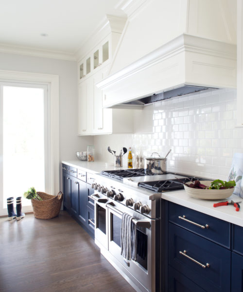
LEFT: In the kitchen, unobtrusive elements like the white quartz countertops, white ceramic subwaytile backsplash and panelled range hood offer a seamless look. “Panelling the hood brings a real elegance to the space,” says Kelly. “It makes it more about the kitchen overall than about the hood and the stove because a steel hood fan draws your eye to it, while the panelled one doesn’t need to be the centre of attention.”
Zodiaq quartz countertops in Snow White, DuPont; range, GE Monogram.
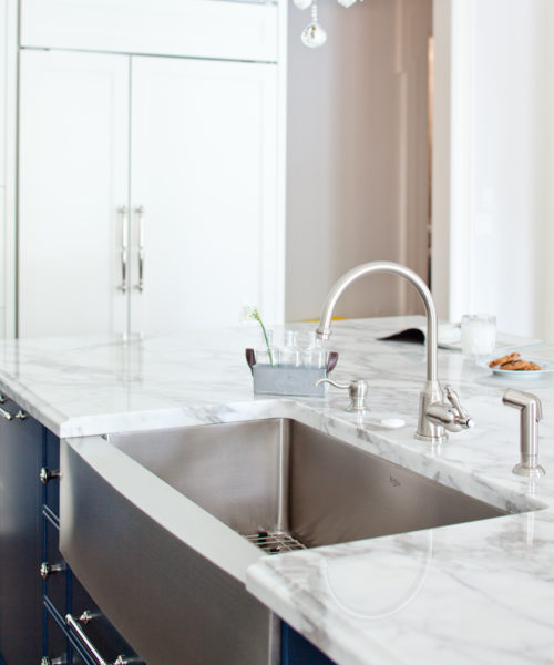
RIGHT: The deep stainless steel farmhouse-style sink is both functional and decorative. With its protruding apron (and paired with an elegant gooseneck faucet), the ample single sink serves as a focal point in the room and is also perfect for washing and filling big pots. The panelled fridge’s curvy door pulls (shown in background) also complement the kitchen’s transitional style. Fridge hardware, Bradford Decorative Hardware Studio; Premier faucet, FaucetDirect.com; Kräus Sink, ExpressDecor.com.


